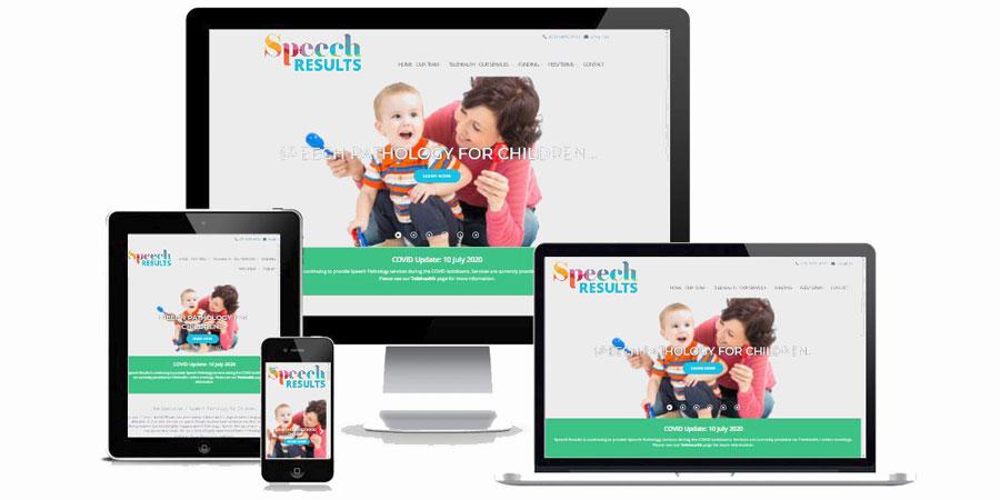
This post is to demonstrate how a website configured with a Responsive Design template changes appearance when viewed on different sized devices.
Here is a website we built in 2019. This is displayed on a widescreen PC monitor - note the amount of space on each side, and the position of the primary menu (click to enlarge):

Recently, Posterous announced on their blog that they were closing down on 30th April 2013. Many of you may not have even heard of Posterous, but as a quick explanation - it was a blogging social network that was positioned somewhere between Twitter (a 160 character micro-blog service) and a full-blown blog such as this one.
Nowadays, a website is pretty much essential for any business but today's business operators need more than just a website if they're going to successfully reach their customers AND beat their competition - they're going to need knowledge. Some of the variety of options to consider as part of a complete online web presence include:

Near the end of a project, new website owners often ask "now that I've got a website - what should I do next?" Good question!
In the past week, two clients have contacted us to ask if they should pay a domain name renewal that has been sent to them in the mail.
Short answer - NO!